Monday 20 April 2015

OUGD502: End of module evaluation

Throughout my second year and especially the PPP module I have researched and improved my knowledge on the business side of graphic design as well as how studios work, giving me an insight into the industry and what can be achieved.  This is something I plan to continue doing over the summer with the hope to get a placement or experience working similarly.  The business start up 

By completing external briefs for clients I've gained experience working as a freelance designer and know the best ways to work to suit what the client wants.  I also spoke to several lettering artists who I look up to, to find out how they work with clients and what the best ways to convey ideas and sketches is.

This year I feel that I have improved significantly as a designer and completing a range of briefs that test my skills in different areas of graphic design has allowed me to develop a broader sense of what I can achieve.  Specifically focusing my time to hand lettering I have seen improvements in this area since last year when my interest for this began.  Since then I have completed several briefs involving hand drawn type which has furthered what I can produce using this skill.  These have been mainly logos and I've found this is something I enjoy doing and could consider delving more into branding in third year.


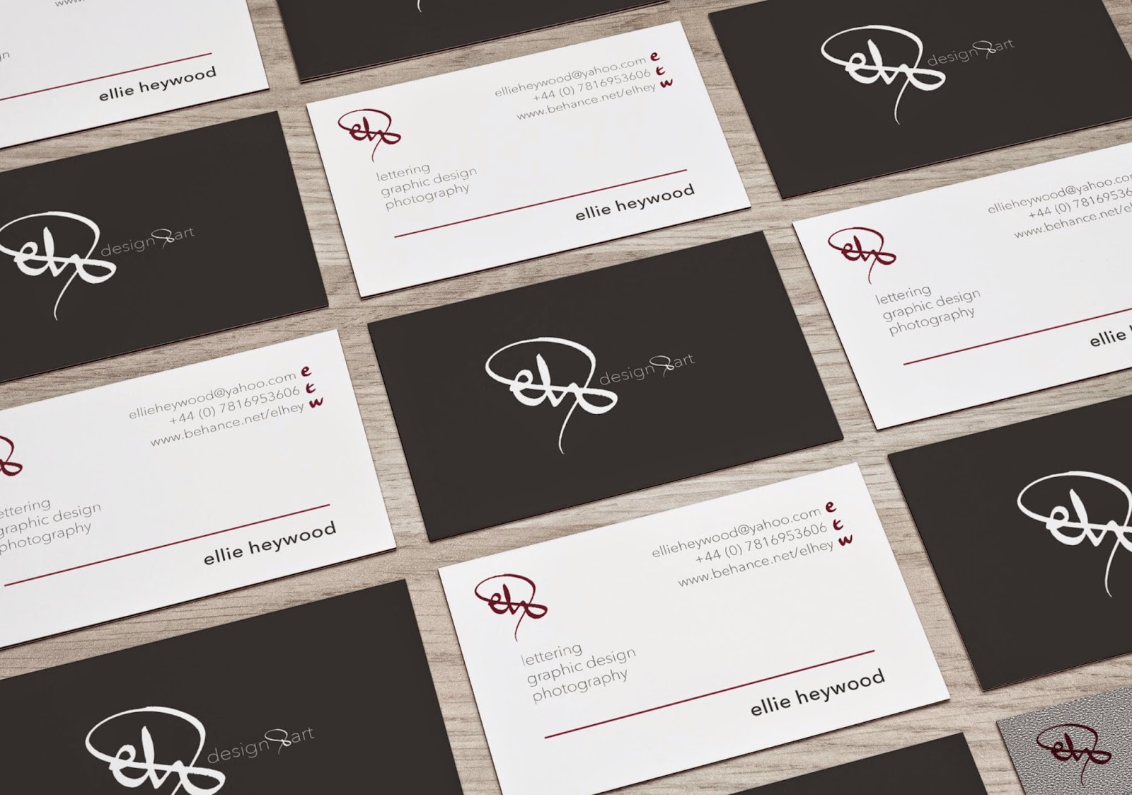
My online presence is something I have improved on a lot this year having uploaded a more substantial portfolio to Behance.  I’ve also engaged a lot more with LinkedIn which has proved to be a really good way of connecting with other designers and artists though I still have a lot to improve my presence on this network. Creating my branding and promo pack was a brief I really enjoyed in this module and feel this has given me a better idea of how I could contact studios in the near future.  

OUGD502: Presentation


Saturday 18 April 2015

OUGD502: Promo Pack

My promotional pack will contain a letter using my letterhead template, creative CV, the lettering booklet and samples of my work including my Feathr designs.  I will also put two business cards in each colour version.

The singular Feathr samples I included were printed smaller than A4 and cropped with a small border. I also included my signature and date on the back allowing the samples to work as individual pieces that could be displayed elsewhere which would remind people of my work.

Unfortunately I had to print the packaging for my material at a smaller size than A4 which meant the booklet of my work wouldn't fit in it, however when I print again I plan to produce it at a larger size. The diagonal cross bar of the ampersand from my logo is perforated which allows the potential employer to separate the sealed cover and opens up to reveal all my work inside.

I also should reconsider the stock choice because when I sealed the pack over the card was slightly too thin to hold a solid structure at the top half of the box.  Cardboard would be more appropriate for this as well as being more economical if I sourced some recycled material.

I intended to create a device that meant the pack could be refastened so it would store my work and be of a nice enough quality for studios to want to keep.


The portfolio booklet I made focuses on hand lettering and typographic briefs, showcasing summaries of the briefs I have encountered, including self initiated projects, and then miscellaneous lettering I have been practicing over the past year.  This is so I can show this to potential employers when they ask for a portfolio of work, and it also shows my bookbinding skills and a touch on editorial design, which I am also interested in.


Ideally I would have liked to spray the edges of my business cards, as they are on mount board there would be a substantial amount of space to cover which would make the edges a bit nicer.  When I print these again I also noted that I need to increase the weight of 'design & art' on the logo so it is readable against the coloured backgrounds.  Ultra light works against the white but not for the logo.

Friday 17 April 2015

OUGD502: Harper's Signs

Following my interest in lettering and sign painting, I searched for local sign painting studios and workshops that I could attend in Leeds while I am on the course.  I found a few business's but Harper's Signs in LS10 proved to be most likely to get in touch with even if just for a day to see how the studio works and what is required in an average job.  I've emailed Dave, hopefully I will hear back soon so I can visit over the summer. Hopefully this could then lead to learning first hand from a skilled professional more about the art form.


Thursday 16 April 2015

OUGD502: Condé Nast

I have recently been in touch with a family friend who works at Conde Nast, publisher of established magazines such as Vogue and GQ. He works within the area of digital design and app design for the magazines, and said he'd be able to put in a good word and assist me in a possible placement with the company. I looked on their website which seems to only offer 6 month full time paid internships, so this is perhaps a position to look into applying for towards the end of my time on the course after I graduate.  I also think this would be better as my portfolio should be at a much higher standard a year from now, with more experience dealing with editorial design.


Tuesday 14 April 2015

OUGD502: Promo Pack Research

After seeing a project on Behance that included a hand made package design, I contacted the owner to get some extra information about the details of his design. I wanted to relate this to the packaging I'm making for my promo pack, to see what the most suitable weight of card or cardboard would be to ensure the box is protective and durable, while still folding well.


This printing studio in Spain has created some interesting projects relating to typography, so it may be an idea to send them a promo pack in hope for work experience with them.


I was also inspired by the packaging fedrigoni have used to hold "pulp" publication which I received last month. The perforated section allows the user to rip open the outer shell which I thought was a good way of engaging with the package. I want to incorporate an element like this in my own promo pack, though one Feature I would improve is that it doesn't fasten again which would be good for storage. 


I worked out a net for my pack cover which shows the bottom half stuck down to hold everything in and the top lifts up once the perforated edge is ripped across. 


OUGD502: Brand application


With more time I would have liked to include some nicer finishes to my business cards, such as embossing the larger logo and spraying the edges of the cards in colour.  There are two versions of my business card - the side with contact details is the same on both however the reverse comes in two colours, light grey and dark grey.  The light grey colour is used consistently across different aspects of the branding, mainly on the back of letterheads and inside of my promotional pack and envelopes.  The simple logo on colour design is carried forward to other mediums such as the iPhone or tablet, keeping a minimal design that is easy to navigate.


Saturday 4 April 2015

OUGD502: Sergey Shapiro


I have recently been doing some lettering commissions and always become stuck with how many sketches to present to a client and whether they should be more finalised or kept in pencil.  I sought help from a couple of artists whose work I follow, noting that they create work of this kind for a variety of clients. Sergey Shapiro is among these lettering artists and I've seen a lot of his final solutions to briefs.  Although his answer is short it is clearly important and time saving to show initial sketches rather than final pieces.  It also gives the client an idea of how you are working, though I am going to try and photograph the sketches under good lighting.