Saturday 28 February 2015

OUGD502: A selection of stuff I've been looking at recently...

Mirrored ambigrams


Type through shadow


I've also seen some other posters and covers that use contrasting tones and gradients to create shapes and forms conveying areas of shadow and light, including a Wired cover.


Found this pattern covering the interior decor of a restaurant while I was away, being attracted to the smooth movements of the curves that remind me of inks flowing in to each other.


I thought this packaging for coffee was quite clever, using the two end letterforms to symbolise the handles of the red coffee cup shapes. Combining type and image in design is something I want to engage more with.


I came across this photo on my phone that I took a while ago when I visited the Munro House gallery.  Having researched a bit about sign painting recently I noticed the gloss enamel paint carefully brushed to form perfectly formed characters. I also like the contrast in colour choice, using a dark tone as the top layer and palest green as the background.


Watched The Graduate last night and thought the dvd cover was quite unusual and unlike other mainstream movies which is what caught my attention.  The repetitive use of highly condensed type is readable and reductive, especially as it's used as a negative, as if cut out from the white page below.  The vertically aligned text balances the composition against the larger, horizontal title.  The large space at the bottom also proves a good use of negative space, a horizontal rectangle making the photo image more square shaped.


Friday 20 February 2015

OUGD502: Logo - Colour and Outline Development

To evolve the outlined version into a more interesting symbol I connected certain lines to form a design that appears to loop through and around to shape the logo.


I explored multiple possibilities in colour and texture to survey which was most appropriate as the final design.  From this I have decided I will have two versions - one outlined and one filled with colour.  I debated using a background colour, however I want it to work across multiple platforms including as a PNG file against different backgrounds if necessary.  The filled shape is more suitable for a logo.

Friday 13 February 2015

OUGD502: Brief 2 - Branding development

We decided to use a goats head for the logo to communicate the name, in a style that is appropriate to our business values and work ethic. The serif typeface conveys a traditional style and approach which reflects how we work, and the stripped back vector line drawing communicates our friendly and informal attitude.


Thursday 12 February 2015

OUGD502: CRB - Craig Atkinson

Cafe Royal Books run by Craig Atkinson publishes weekly photo zines of a different topic per week.  I first came across the booklets through Facebook, and noticed that some subjects published about were in areas near to my home town which drew my attention closer to these zines.  The simple black and white layout with popular sans serif typeface Helvetica is a clean aesthetic that I have used in my work before and am attracted to due to the minimal, rigidness of the typeface attributes and grid system.

From this initial recognition I followed the business on Twitter, Instagram and looked at their website which holds an archive of all publications.  I was inclined to contact Craig for advice on photo zine production and layout design as primary research for a responsive brief to create my own photo zines.  The first time I contacted him I got no response, but have recently sent another email as I am nearing the final production of my booklets and wanted to know a bit more about self-publishing and production methods.


Although this is a short response I'm glad I received a reply; at this stage in my design process I had tested creating my zines by cropping and binding by hand which proved very difficult to produce accurate and consistent results each time.  Here I have my answer; for such a large run (often CRB releases editions of 200) it is far easier for the printer to do all of the work especially when releasing a new booklet every week. I can use this knowledge in my future work if I decide to self publish any books or zines.

Saturday 7 February 2015

OUGD502: Brief 2 - Research into business

On the week long course we learnt valuable information from several professionals within each area of business start ups:

Nick Scott - writing a business plan
Keith Evans - mission and values / managing money
Anna Franks - marketing
Keith Arrowsmith - legal and intellectual property
Russell Smith - self employment

Myself and several other friends on courses across the college had an idea to start a collective under one name, allowing us to collaborate and work professionally under one brand.  We believe that our range of skills can be used effectively if we work together to produce both commercial jobs and social assignments about world issues we feel strongly about.


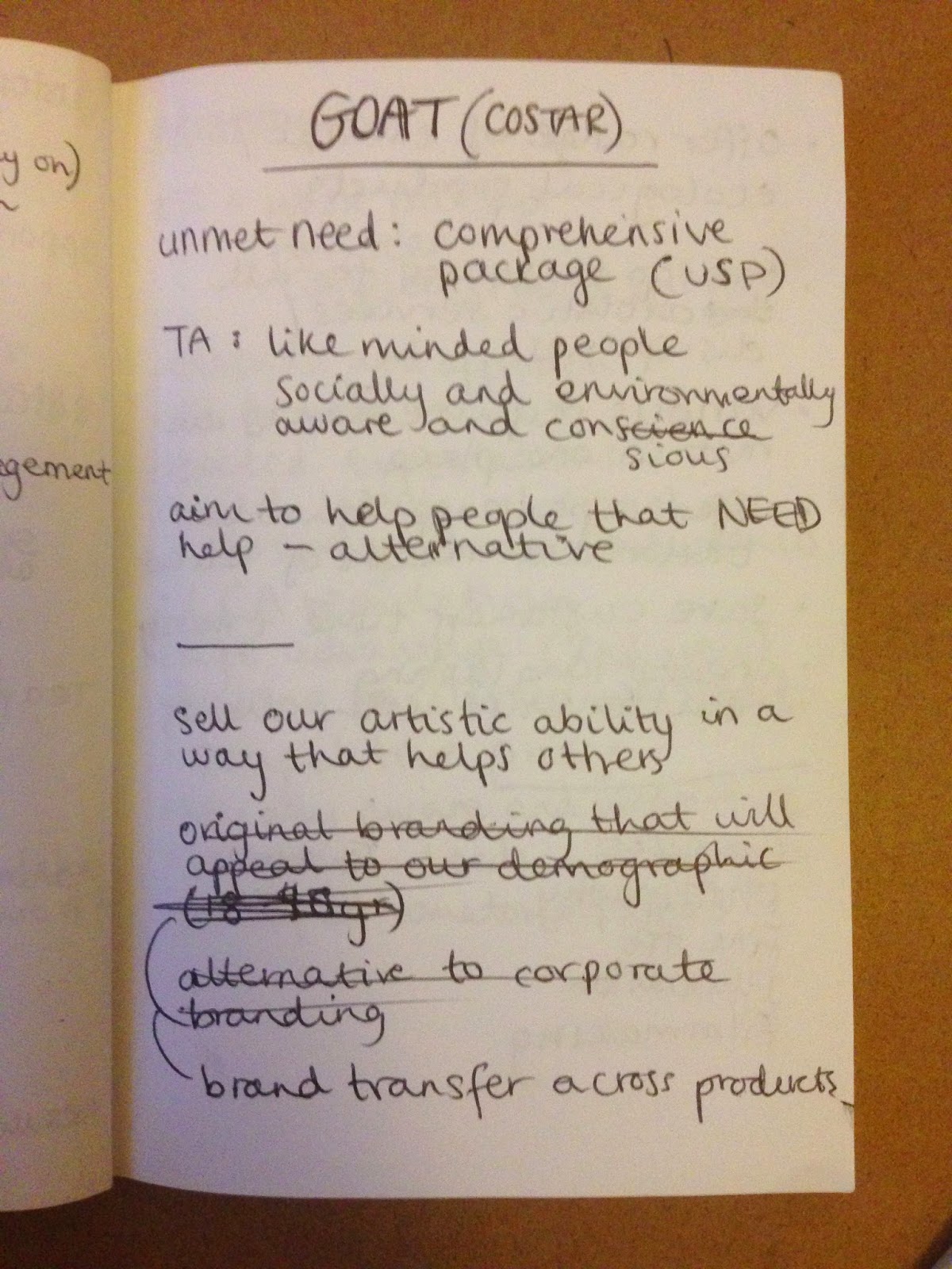
We looked into the structure of our business, what skills we can offer, our target audience, and how we will compete.  Our values as a company involve keeping the attitude informal which creates a better working environment, and in turn, we produce a higher quality of work.  The advantage of being friends will allow us to crit each others work without any hesitation to be straight forward and honest with feedback, as well as taking criticism on board without taking the comments personally.  Managing our own time means it is up to the individual to get the job done, however we all motivate one another throughout each brief.

Our skills and services include a broad range of creative disciplines, such as art direction, graphic design, illustration, photography, film, branding and advertising which enables us to cover the market for businesses looking for creative assistance.  By providing work across different fields, companies can get all their promotional material and branding (e.g.) from one business, which will ensure consistency of design throughout all aspects they require (such as branding, website, adverts, etc).  The package deal also means that we can charge a more reasonable price for start up businesses - one audience we are targeting - because they will be more likely to need work from each discipline at once.

We were introduced to several different business models including sole traders, LTD companies, partnerships and not-for-profit's.  We felt that the best model for us was a limited liability partnership, as it is suitable for the number of people in our collective to work with no rigid hierarchy and eliminates the risk of bankruptcy for the individuals - only the business will suffer if anything were to go wrong.


One of the business consultants we spoke to, Anna Franks, talked to us about marketing plans and the best way to expose your business.  We needed to consider what we had to offer and how this would compete with other, similar companies or design agencies.  Identifying our target audience is also a step towards successful marketing.  What are the benefits of the features of our business?


Using the COSTAR business model introduced to us by Keith Evans, a consultant from CIDA, allowed us to explore every aspect of our business so that we knew the idea was completely viable.  This pushed us to look at areas for customer, opportunity, solution, team, advantage and results.


http://www.gannons.co.uk/blog/llp-vs-ltd/

Wednesday 4 February 2015

OUGD502: Brief 2 - Taking care of business


In this studio brief I will be working in a group of three on a business proposal for a studio that offers a range of creative disciplines. Some aspects of the start up process we need to consider include what we have to offer, who we are targeting our services at, and financial considerations.

Following an idea we have already considered, help and advice we received on an enterprise course left us with a much fuller visualisation of our business idea.


We signed a partnership agreement stating our intentions in the business and how the shares are handed out, as well as the main address of the business, the name, and what services we provide. 


Tuesday 3 February 2015

OUGD502: Logo - Developing my identity

Self branding

Some initial ideas for my personal branding development differed enormously from what I originally produced towards the end of last year.  I feel that this represents my preference in modern, minimalist design and in turn reflects my style of work using just vertical and horizontal lines to create a shape symbolic of my initials 'EH'.  


I worked within the boundaries of a square as I felt this was most appropriate and versatile for use on social media websites, as well as reinforcing further the straight-edged structure of the image.


After months of contemplation and dissatisfaction with this design, I decided to go back to sketching to come up with something more suitable for my practice and personality.  Through developing my skills in hand lettering and drawing, it was obvious that I should represent myself through an image of the same medium so I began hand drawing more loose forms to portray this. 


I also looked at the logos and branding of some lettering artists who's work I have been looking at recently.  They generally write their name or initials in a hand lettered style, which fits with the context of their work.  Taking this into account I feel that the new sketches and ideas for my own branding are more suitable than my original choice - although it was an appropriate composition to demonstrate my interest in print and editorial design, more recently I have been working on lettering and typography.

My brand will no doubt change again at some point, as John has spoken to us about before.  As interests change so will your branding; constantly developing and learning new skills will encourage this.


After deliberation over minor elements of the composition, I have decided on the last version which shows the initials of my name surrounded only about 70% of the curve, with the start of the loop crossing through the centre horizontally.  This forms a reflected distortion of an ampersand sign (when ignoring the letterforms) representative of the various disciplines within design that I involve in my work.  These include graphic design, photography, and lettering.  Having letters within the symbol rather than just an icon is more relevant to me because my main focus is typography and lettering.  My current practice involves primarily lettering work which is why I've chosen this style to illustrate my design.